
2
Logo
Index
2.1
2.2
2.3
2.4
2.5
Overview
Logo
Symbol
Word mark
Do's & dont's
2.6
2.7
2.8
2.9
2.10
2.11
Scaling principle
Scaling limitations
Scaling in composition
Scaling with type
Placement
Pairing
2.12
2.13
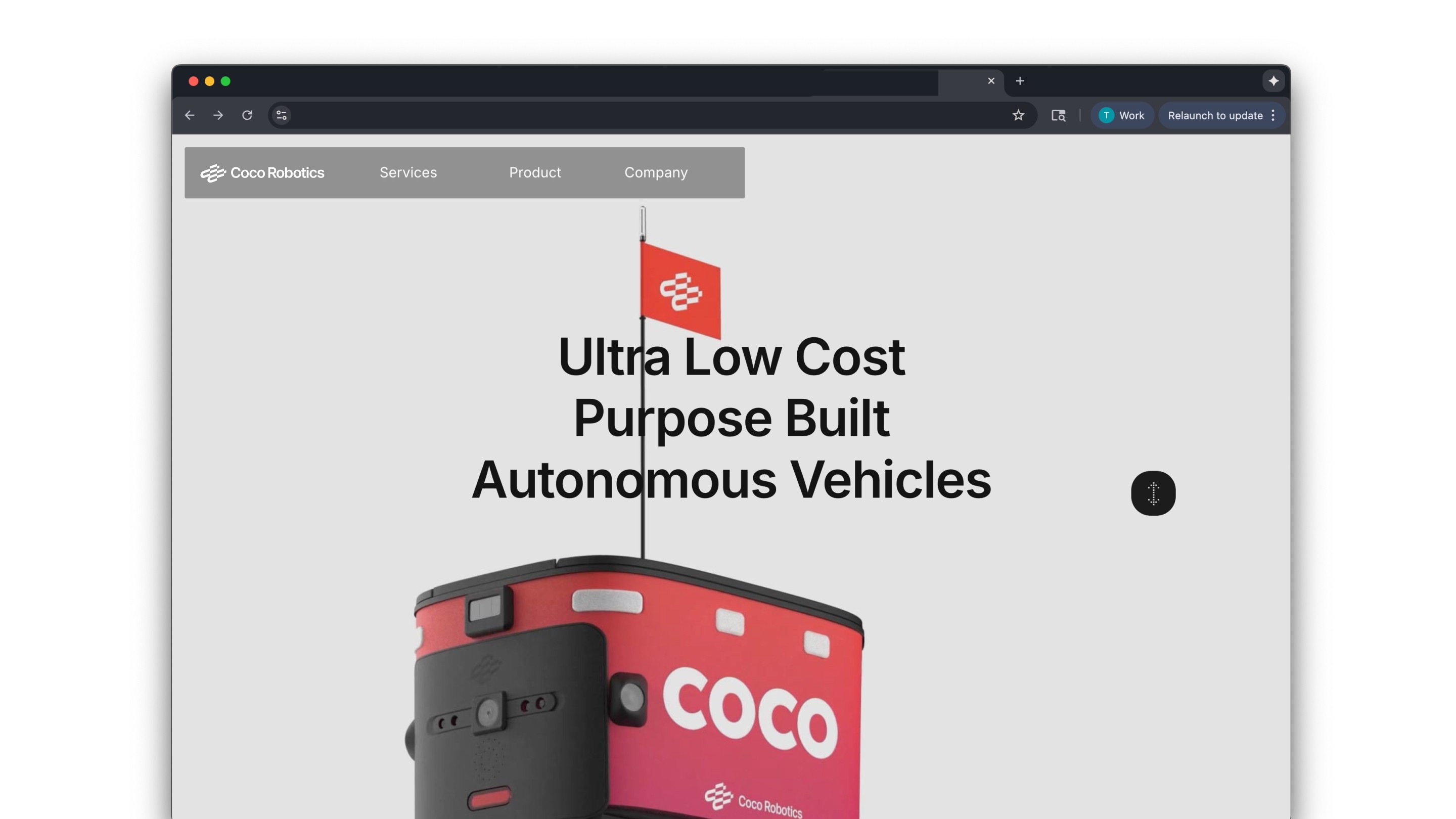
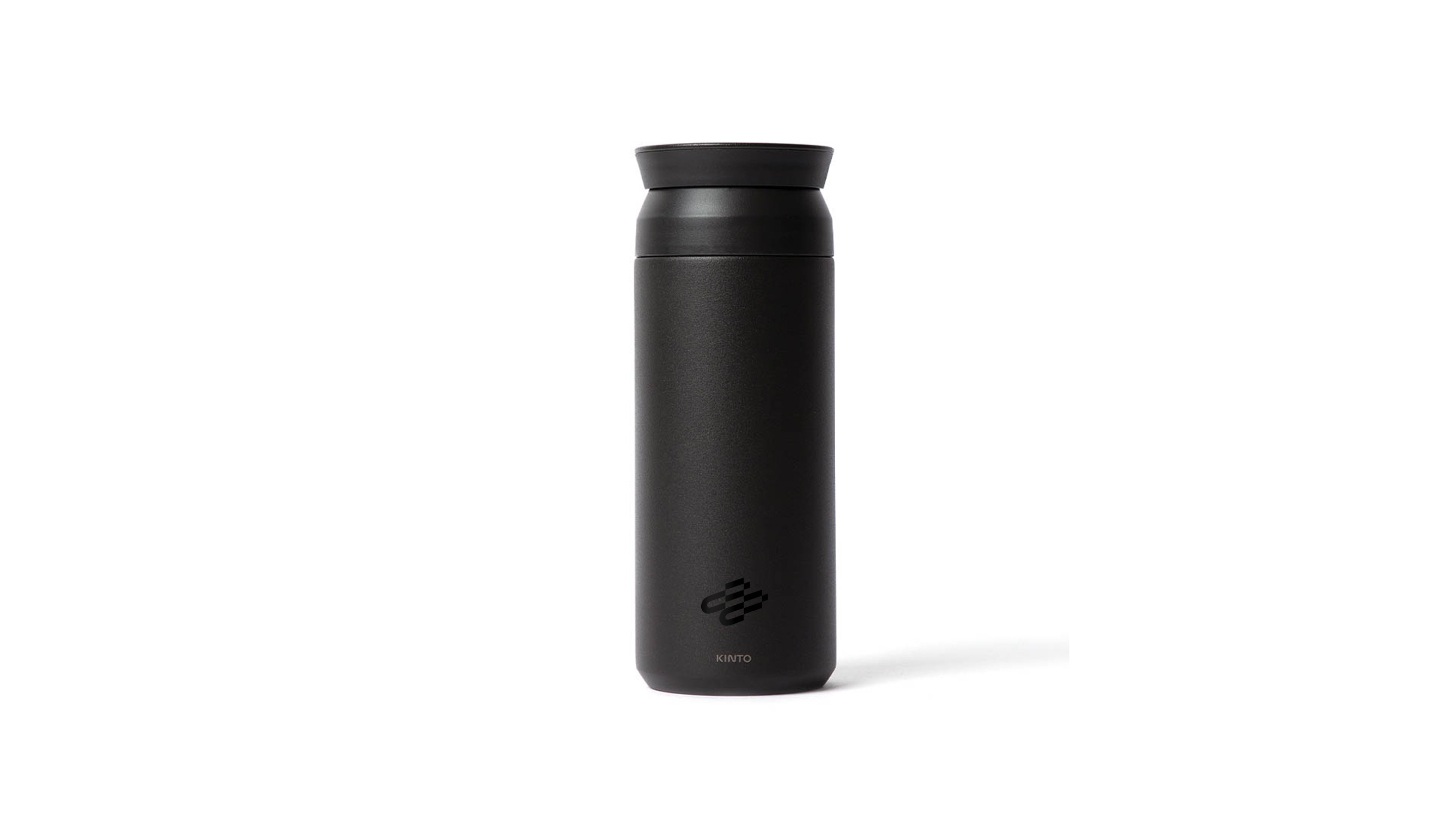
Application
Partnership
2.1
Overviews
Use the correct logo format for the appropriate context, from formal for official materials, casual use.
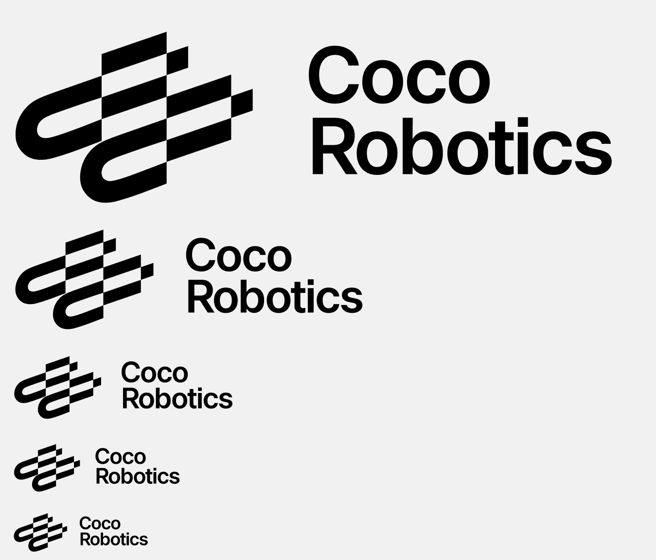
Primary logo
Formal use

Secondary logo
Formal use


Tertiary Symbol & Word Mark
Casual use


2.2
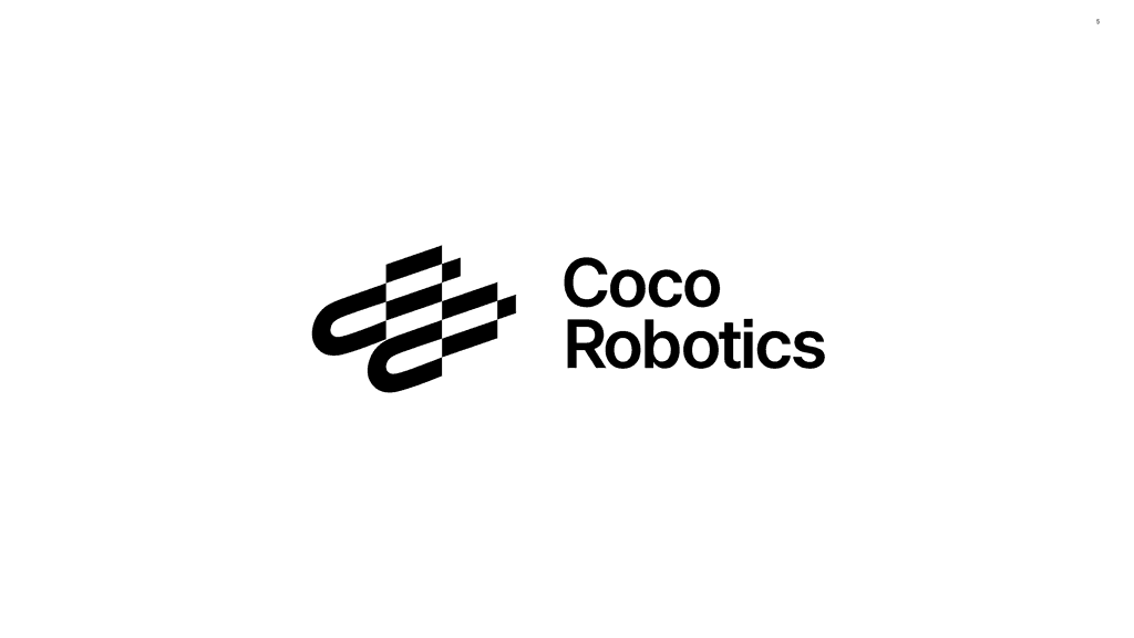
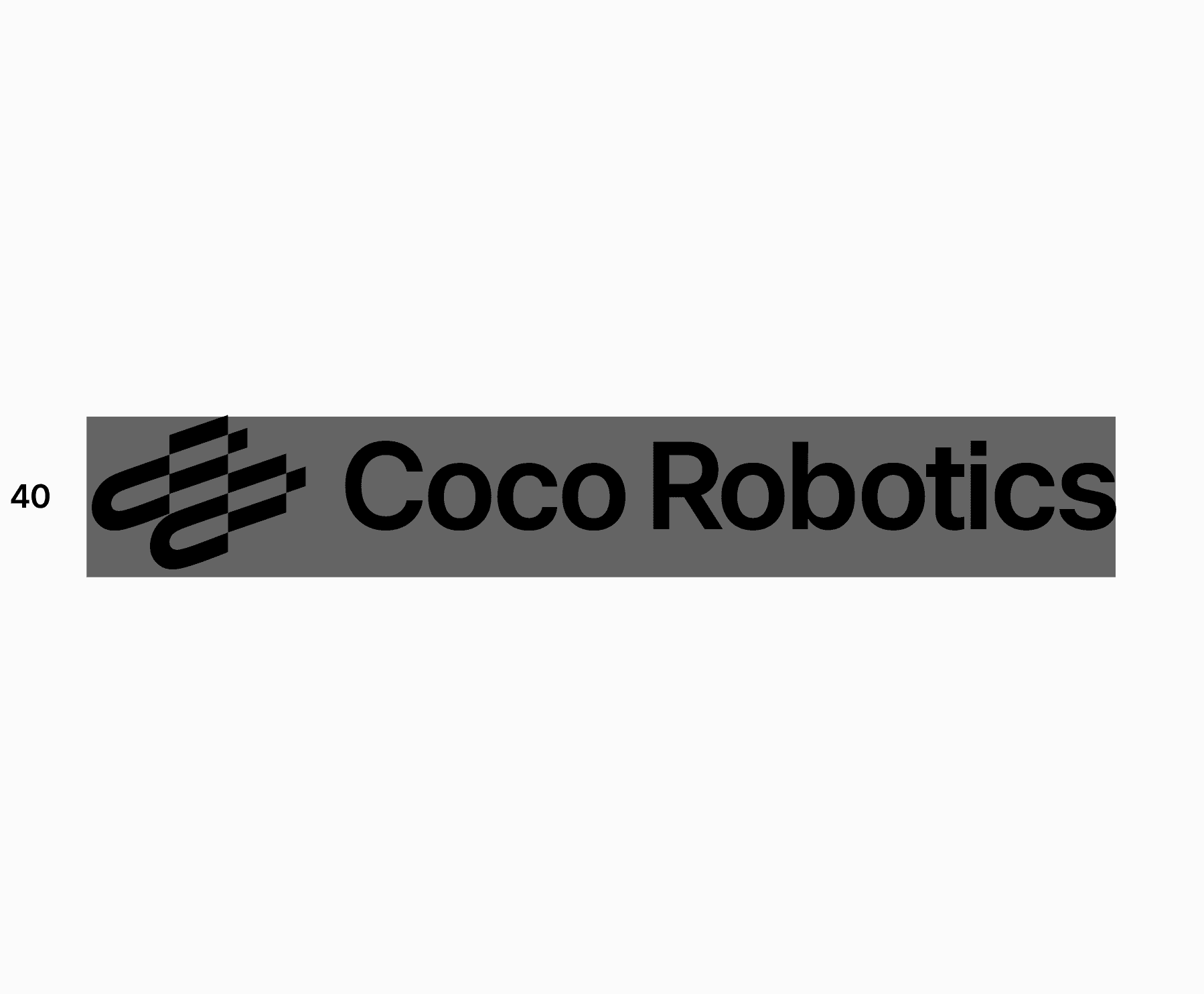
Logo
The logo is our primary identifier. It contains both the Coco symbol and our name in the wordmark. It should be used most often to represent our brand, especially to an unfamiliar audience.
No Grid
Grid

Details
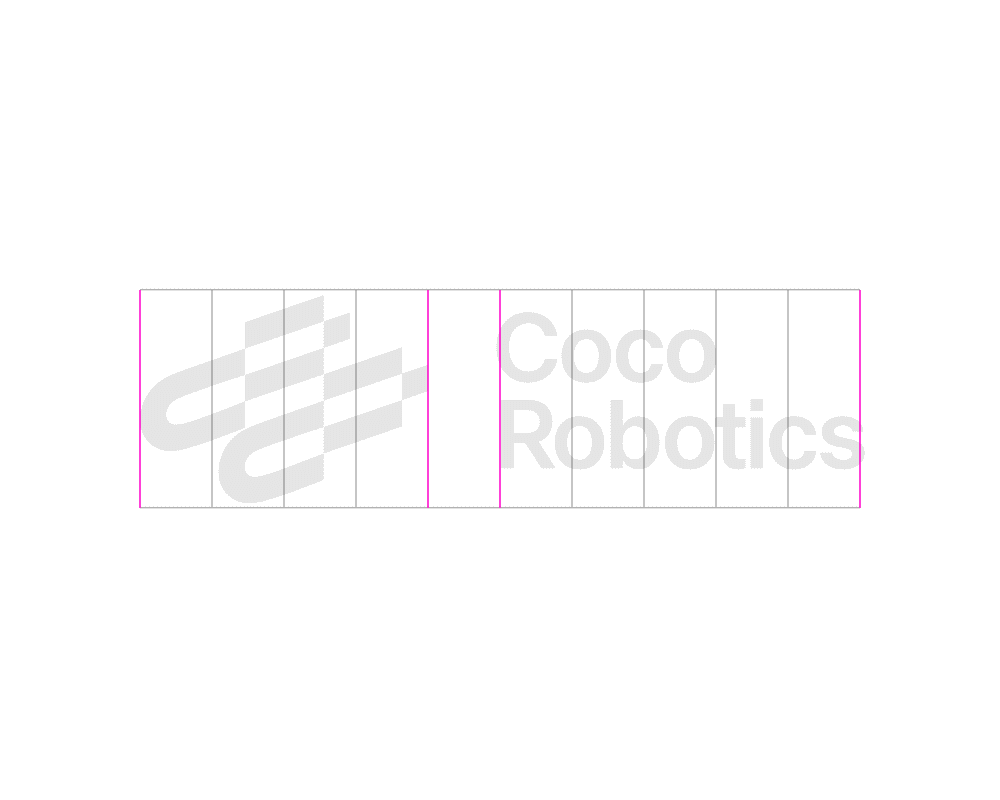
2.3
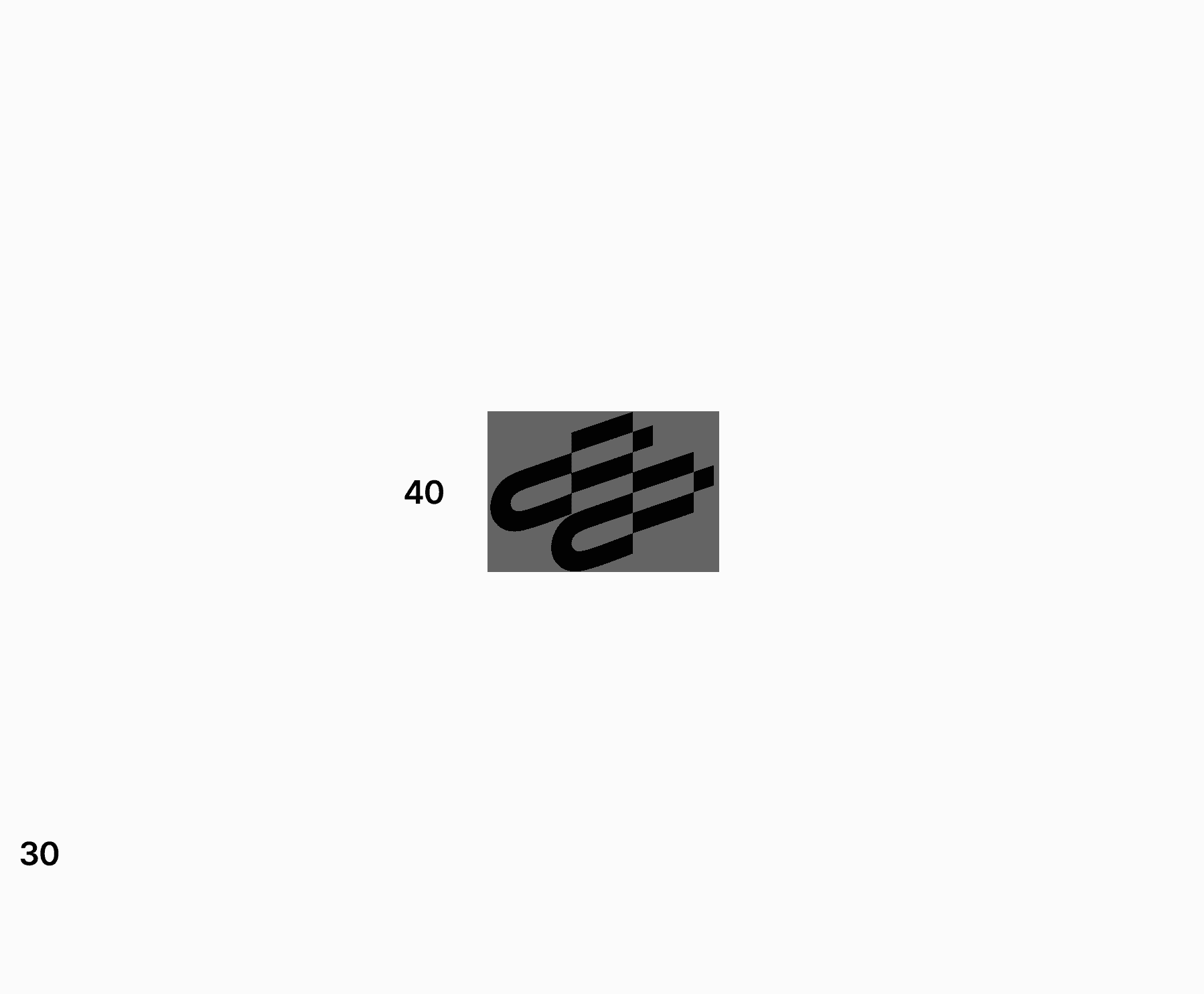
Symbol
The symbol is our new epic element and with it we carry forward our story. It should be used often as both an expressive and informative element. However, always consider the audience and pair with the wordmark when needed.
No Grid
Grid

Details


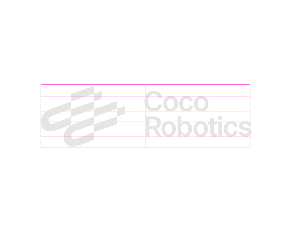
2.4
Word Mark
The wordmark carries our name and with it, our legacy. Use it often in both expressive and informative applications, especially when the audience may be unfamiliar with our brand.
No Grid
Grid


Details
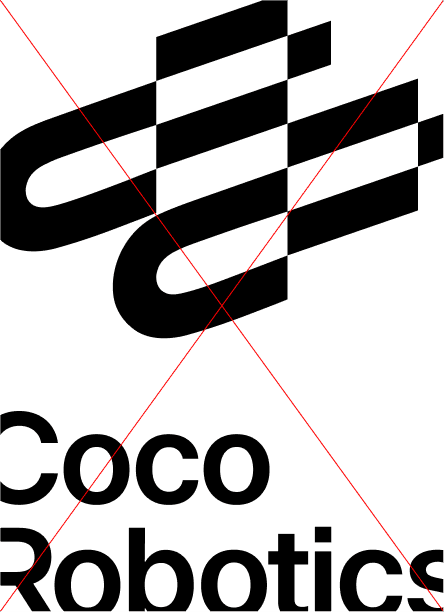
2.5
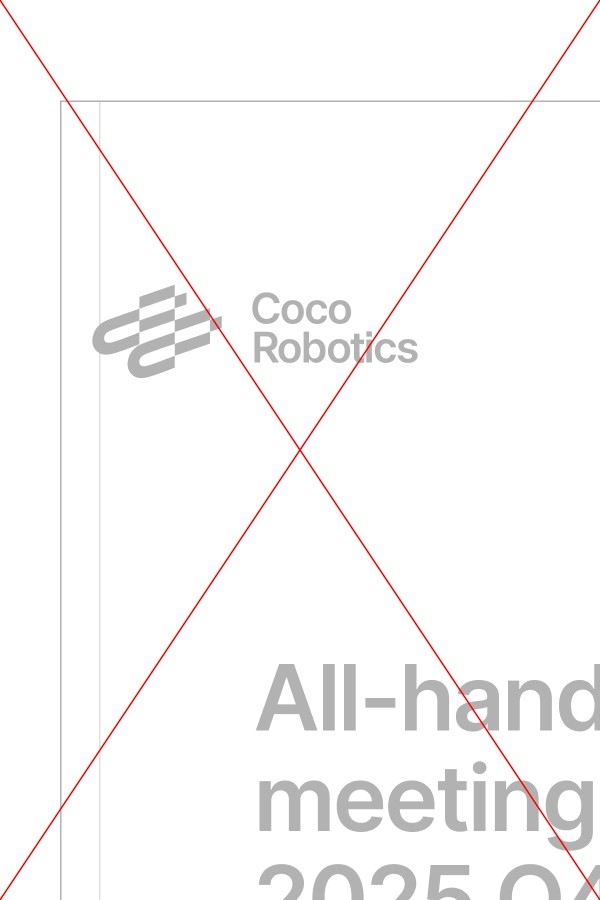
Do's & Dont's
Following the dos and avoiding the don’ts protects the brand’s integrity, keeps it visually recognizable, and maintains a cohesive, professional identity.
Do's
Following leading.
Follow alignment.

Follow spacing.
Dont's
Do not drop shadow the logo.

Do not rotate the logo.
Avoid busy background.

Do not outline the logo.

Do not stretch or distort the logo.

Do not color the logo.

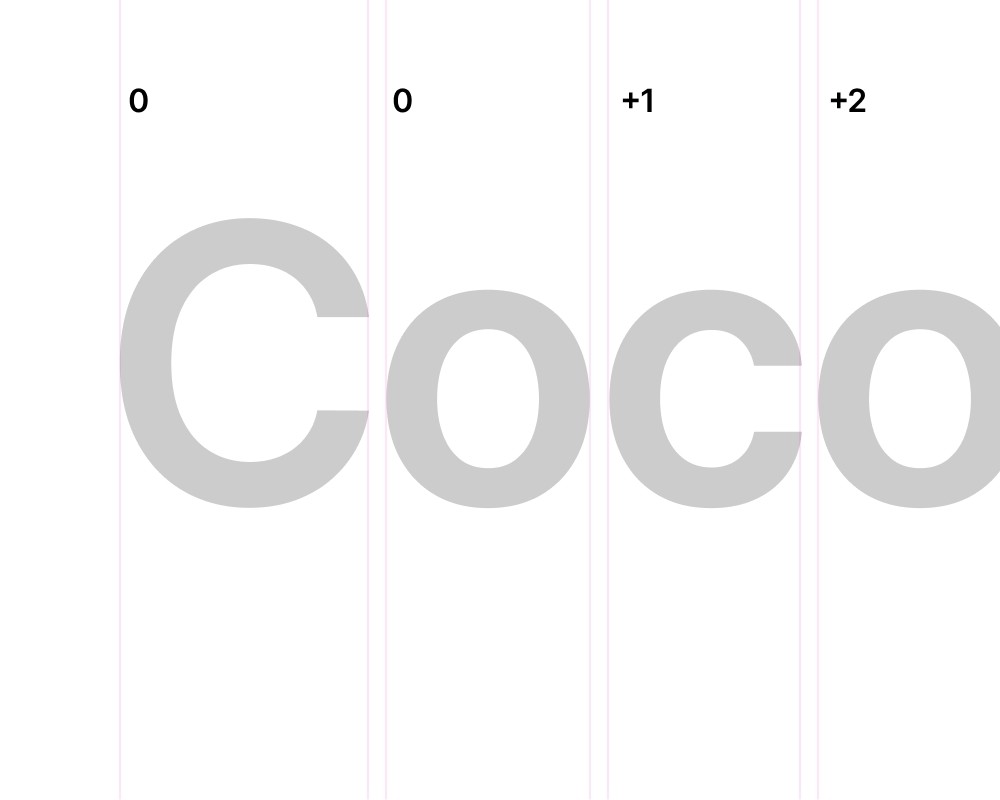
2.6
Scale Principle
The Coco logo must remain clear and legible in all applications. The minimum size is approximately 40px in height (or the equivalent proportion shown), ensuring details are preserved. And each form of logo will have their own minimum size.

Minimum Size
H 40px
Too Small
Anything below the Minimum size
is not accepted.
2.7
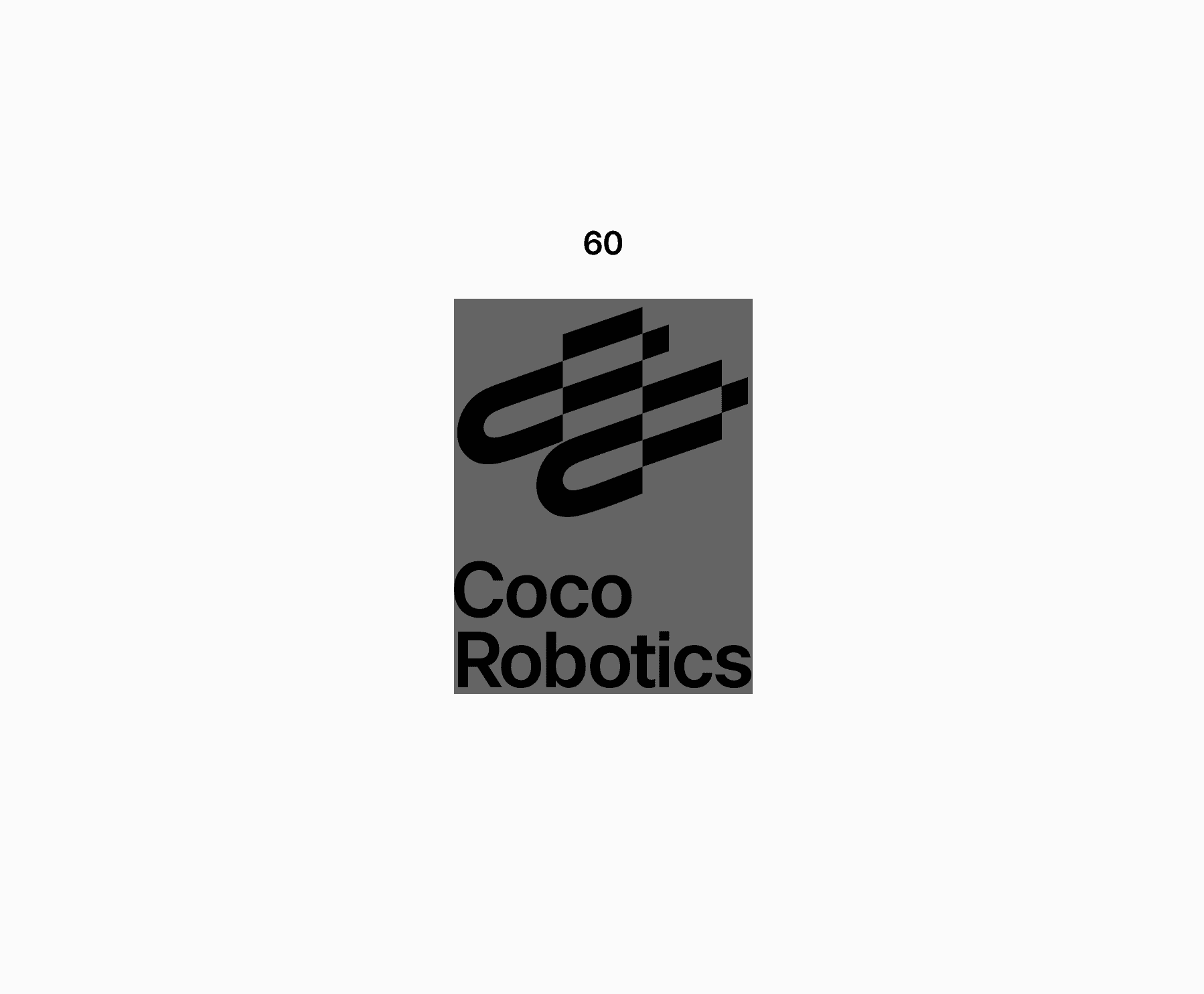
Scaling limitations
Always use your best judgment when scaling identity elements. Though application size will vary, avoid using each smaller than the following amount.
Use the following values for minimum
sizes for hand held device.
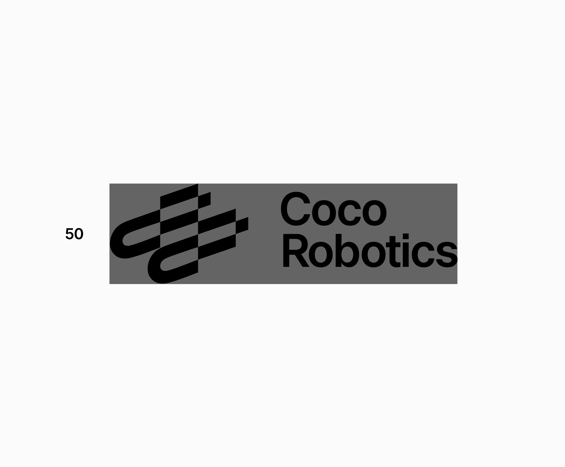
Logo (vertical)
H 50px
Symbol
H 40px
Logo (horizontal)
W 60px
Word mark (2 line)
H 50px
Logo (narrow)
H 40px
Word mark (1 line)
H 30px
2.8
Scaling in composition
Always be sure the elements can be easily seen and understood. If they are difficult to read, they may be too large or small. Do not crop identity elements unless for specific intent.


Scaled as Footer
Scaled as Header
Too large
2.9
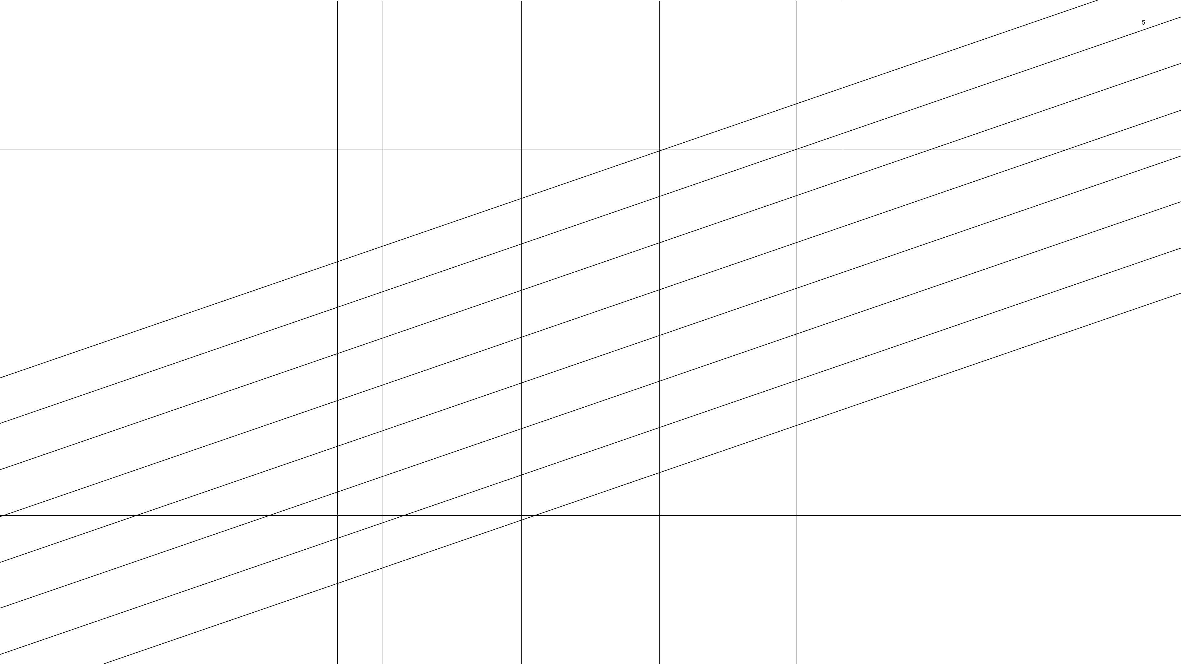
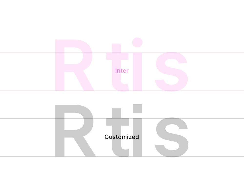
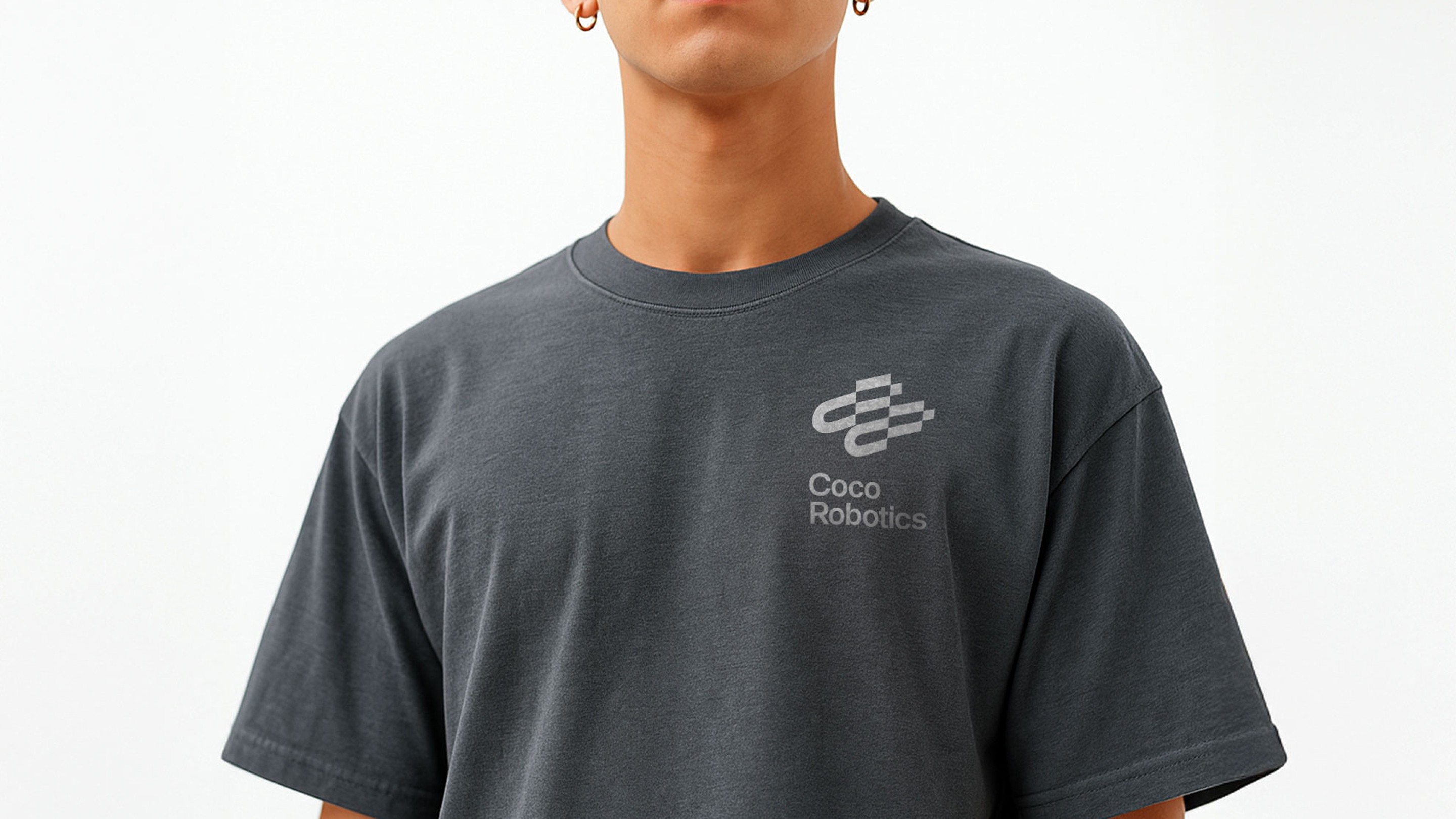
Scaling with type
To maintain visual harmony, scale the logo proportionally in relation to surrounding typography. There is no fixed ratio, so adjust based on application and type size, using the x-height and cap-height as initial references. Avoid making the logo larger than the headline text unless the content specifically focuses on the logo itself.
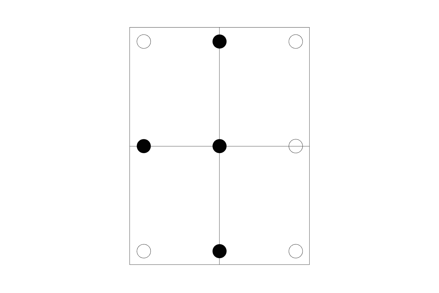
Horizontal alignment
Any surrounding elements should align with the typography in the logo. Align either cap height to cap height or create a clearly intentional contrast.
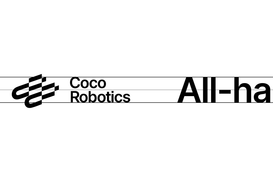
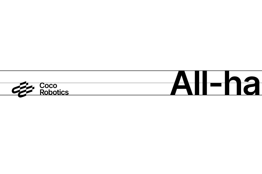
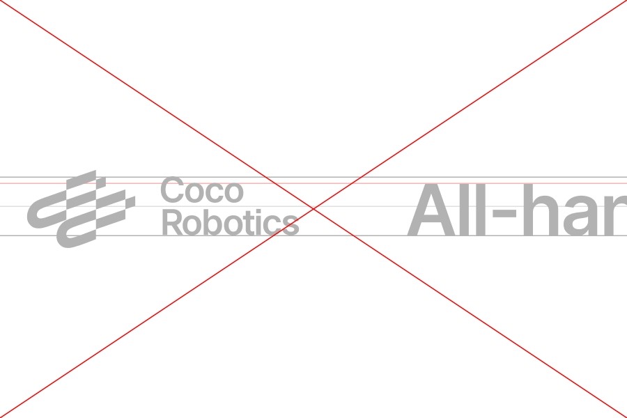
Matching cap heights
Clearly intentional contrast
Avoid tangent but not exactly matching relationship
Vertical alignment
Additional elements can align with either the wordmark or the symbol, depending on the composition and surrounding space. Ensure there is sufficient breathing room for the chosen alignment, and avoid awkward or unbalanced whitespace.
Align with the edge of element
Align type when enough space
Avoid aligning type if tight space
2.10
Placement
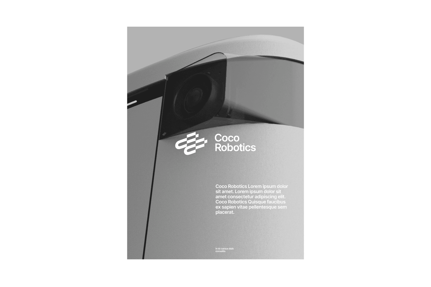
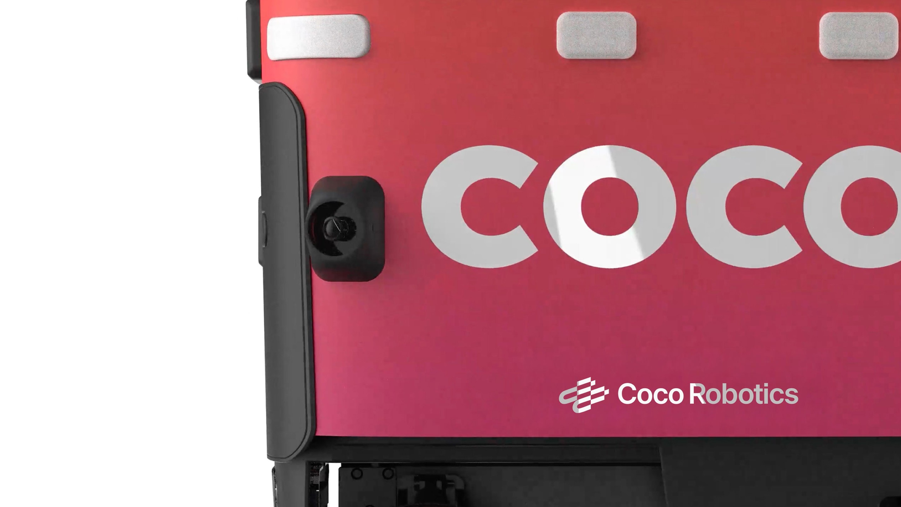
Depending on its placement, the elements can serve a different purpose in a composition. Consider both the audience and application when choosing the right placement. For more informative or direct uses, use corner placements. For more expressive uses, use center placements.
Corner Placement
The identity acts as a supporting element
No Grid
Grid

Center Placement
The identity acts as an expressive element
No Grid
Grid
2.12
Application
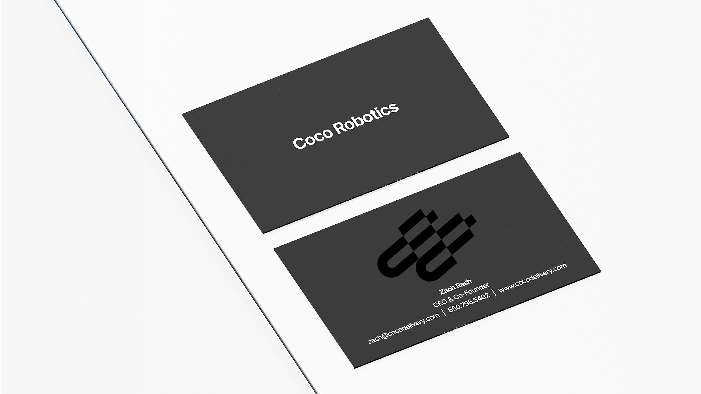

2.10
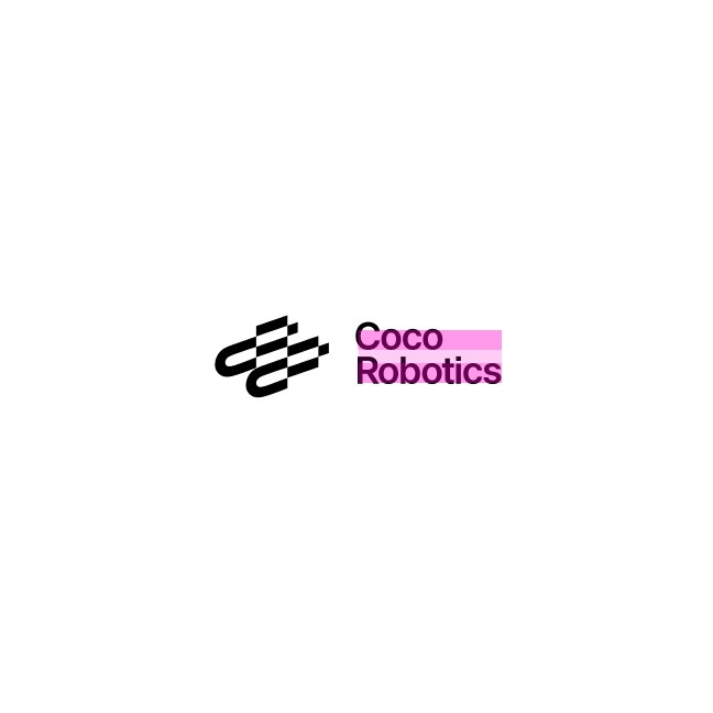
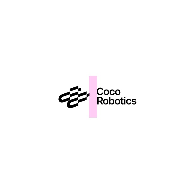
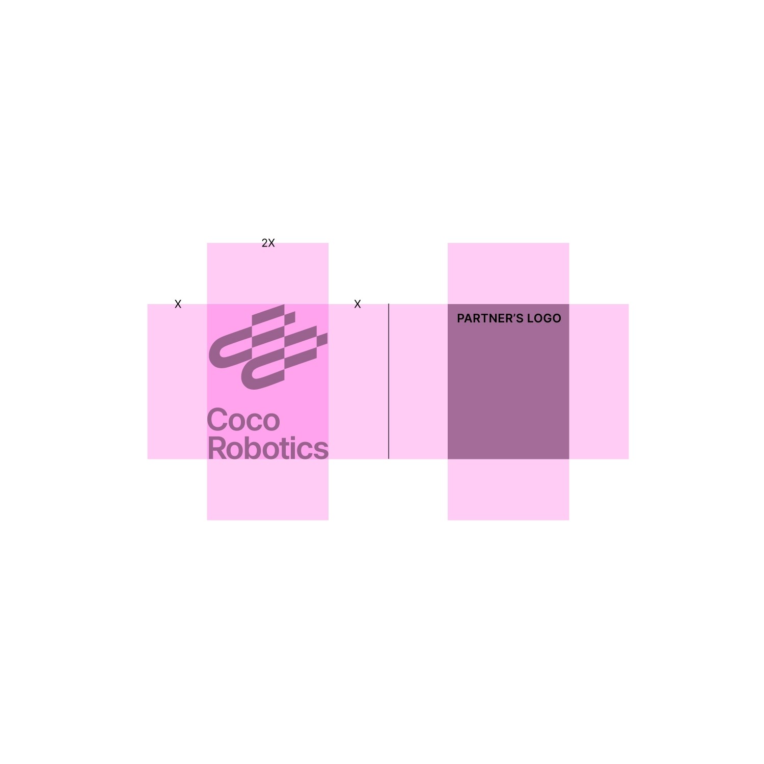
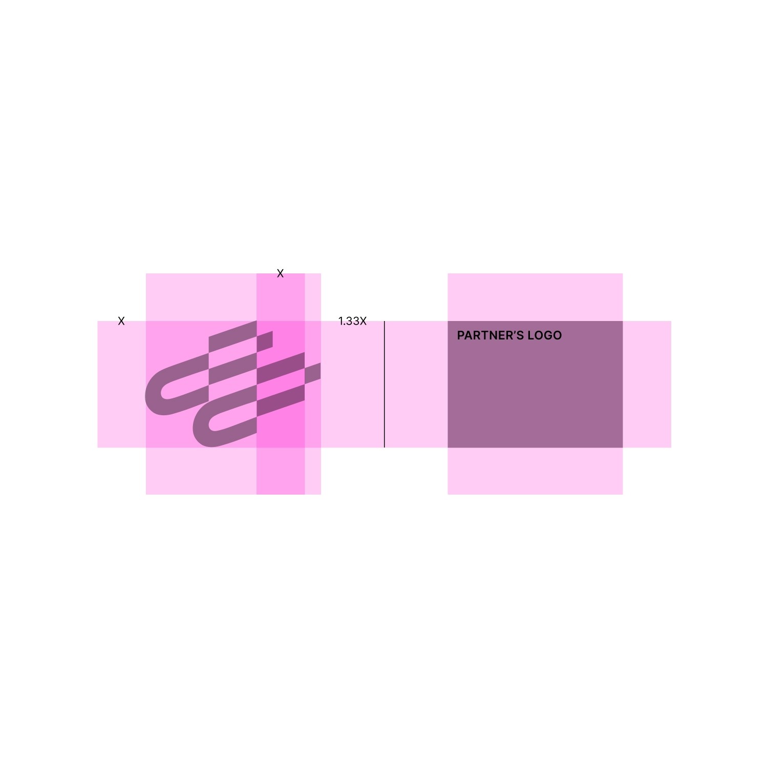
Partnership
For collaborations or projects with other brands, our identity is used alongside others with our co-branding device. The logo and symbol can both be used in either black, white, or red depending on the application needs.
Horizontal Partnership
These are own primary lockup for co-branding. This is mostly used in the landscape scenario.
No Grid
Grid


Matching cap heights
Clearly intentional contrast
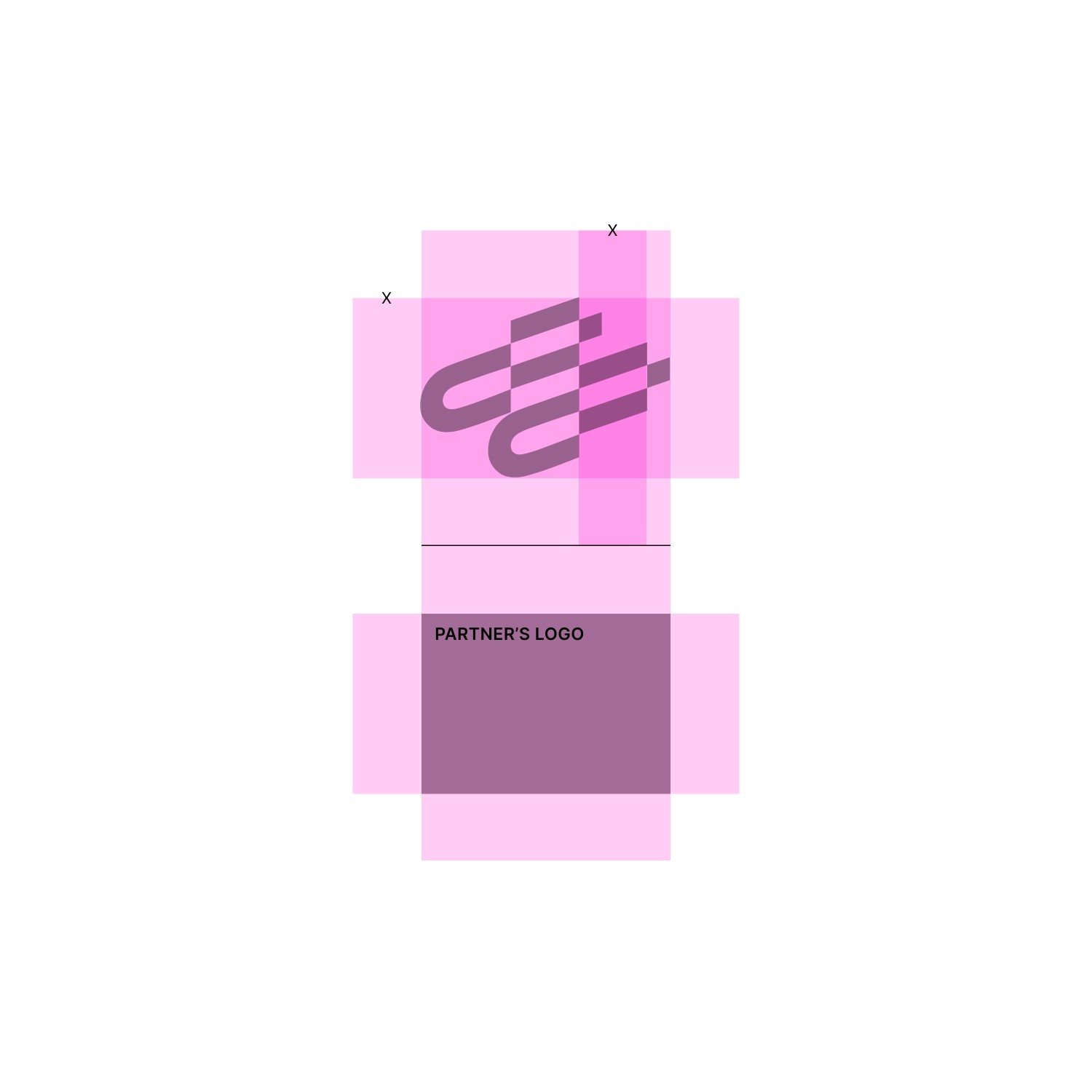
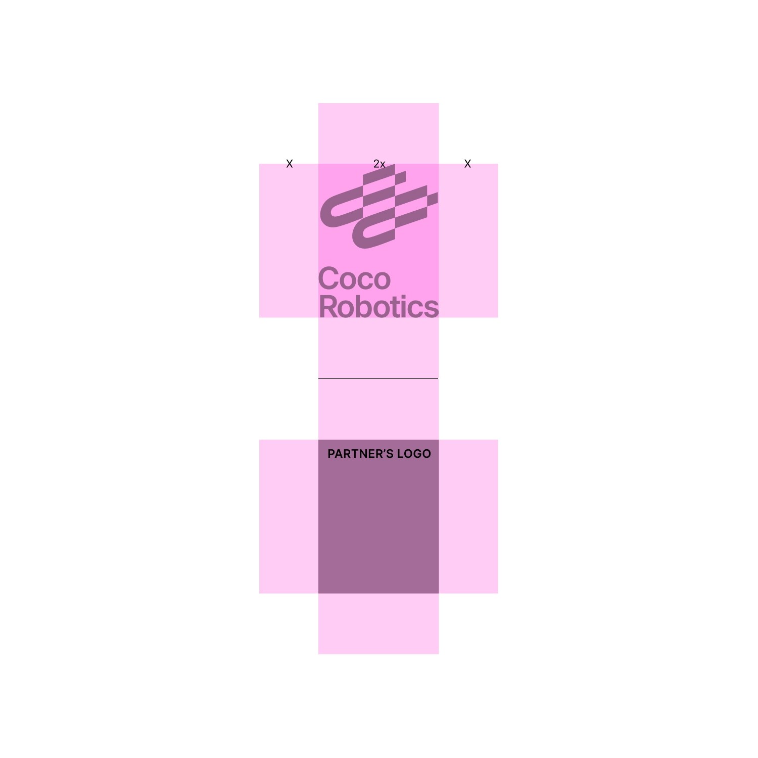
Vertical Partnership
These are own primary lockup for co-branding. Mostly used in mobile and mobile device.
No Grid
Grid


Matching cap heights
Clearly intentional contrast
Colophon
v1.01
last update 2025 Oct
This brand guideline was designed and compiled by the internal Coco Design Team.
Typography set in inter.
Layout created in Figma.
Create and run on Framer.
All photography and mockups © 2025 Coco Robotics unless otherwise credited.
Printed / distributed digitally in 2025
For inquiries, contact info@cocodelivery.com
Please use desktop to view the guideline
Colophon
v1.01
last update 2025 Oct
This brand guideline was designed and compiled by the internal Coco Design Team.
Typography set in inter.
Layout created in Figma.
Create and run on Framer.
All photography and mockups © 2025 Coco Robotics unless otherwise credited.
Printed / distributed digitally in 2025
For inquiries, contact info@cocodelivery.com